Article
3 min
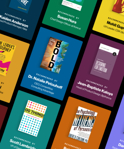
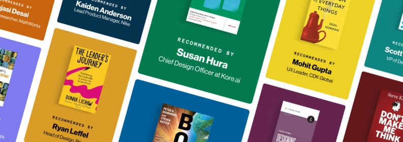
10 Books Every UX Leader Should Add to Their 2024 Reading List
We asked industry leaders what books they recommend to new and experienced UX professionals — here are our top picks for the year!
Blink articles, videos, podcasts, and events covering the latest in UX research, strategy, and design.
3 min
We asked industry leaders what books they recommend to new and experienced UX professionals — here are our top picks for the year!

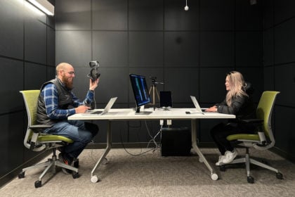
6 min
Realizing the potential of AI-powered tools starts with uncovering how you can — and should — use them.
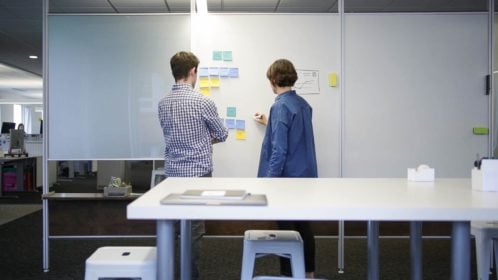
10 min
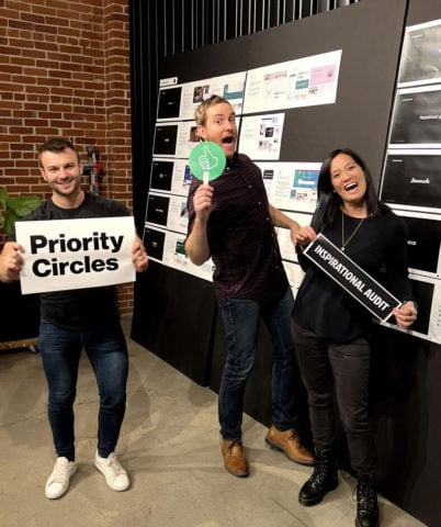
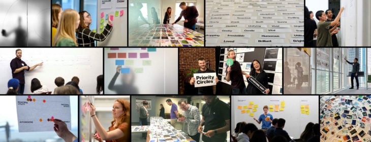
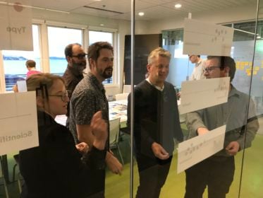
Say goodbye to awkward and clunky design workshops. Here are our tips to ensure your team leaves every workshop focused, inspired, and aligned.
1 min
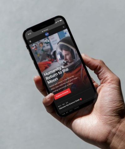
NASA released its updated website last month after two years of rigorous user experience research, strategy, and design in collaboration with Blink UX.
6 min
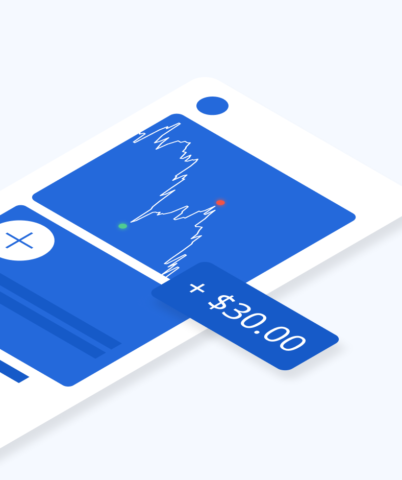
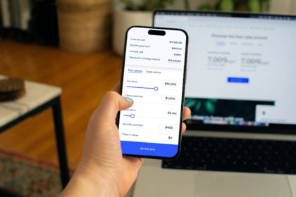
Your guide to creating a modernized mobile banking or investment app experience — based on our latest banking research.

14 min
Want to design more inclusive products? Learn how, plus, get started with free resources as a guide.
3 min
NASA honored with 2024 Webby Awards for the reimagined NASA.gov website and the new streaming service, NASA+.

4 min
I asked our researchers what they’re doing lately to make their jobs easy, fun, and efficient — here’s what I heard.
6 min
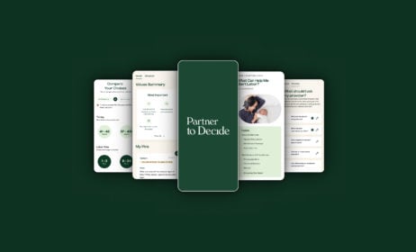
Learn more about Blink’s pro bono client, Partner to Decide, directly from the founder.
8 min
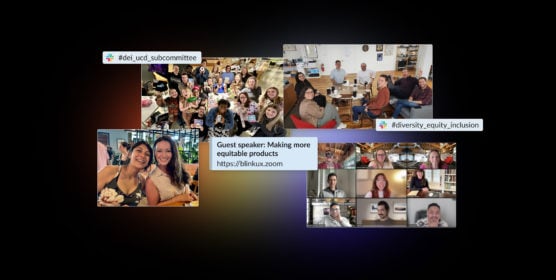
A look at our continued journey toward a more diverse, inclusive, and equitable company.

5 min
How to bridge the future with the here and now and generate the product vision necessary for being a leader in your sphere.
5 min
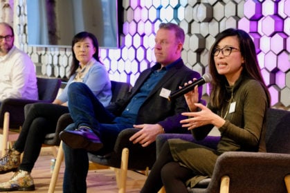
We sat down with Oracle Cloud’s Vice President of User Experience to learn more about leading in UX.
4 min
Why investing in customer research makes sense.
4 min
Applications are open for Blink's 2024 Pro Bono Program!

3 min
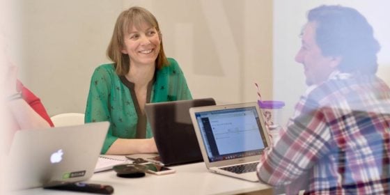
Lessons from industry leaders on what makes a successful UX career.
3 min
We asked industry leaders what books they recommend to new and experienced UX professionals — here are our top picks for the year!

5 min
10 Days of Gratitude is a Blink annual tradition that allows employees to share with their communities and pay it forward.

6 min
Realizing the potential of AI-powered tools starts with uncovering how you can — and should — use them.
14 minutes
Our tips for using automation to create efficient, personalized experiences that meet patient needs.
18 minutes
Here are five key UX opportunity areas healthcare systems are looking at for improving the patient/provider experience.
9 minutes
When coupled with a good user experience, personal health apps and data can inspire positive behavioral or lifestyle changes.

10 minutes
Blink has worked with a variety of healthcare providers over the last several years to understand the users of their websites. The results of this work have been research-based recommendations and design solutions that address many common challenges. Today, we are publishing a whitepaper that summarizes the challenges providers face online, and how a research-based approach to user experience can help meet the needs of their patients and employees.
14 minutes
From chatbots to intelligent assistants, conversation interfaces are changing the way that people interact with their computers, and designers have a unique opportunity to shape this medium at the ground level. Like all emerging tech, best practices are still being developed, but here at Blink we’ve had the opportunity to design a few of our own and learned a lot along the way.

19 minutes
In this follow-up we’ll be diving deeper into some of the specifics of what makes a great user experience for IoT products, focusing on the critical areas of onboarding, support, and security.
22 minutes
Smart homes. IoT. Connected devices. VR. What happens when buzzy, emerging technologies begin to infiltrate the everyday? Will consumers face a frustrating gunfight-style showdown with new products, or will they discover a frictionless setup process and experience a product that enhances their life? It all depends on how much effort you put into UX.
2 min
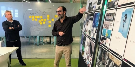
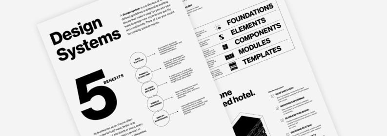
Design systems are powerful for teams who want to save time and money in their design process. Here's why we love them, and how NASA used a Blink design system to unify its web experience.
10 min
Say goodbye to awkward and clunky design workshops. Here are our tips to ensure your team leaves every workshop focused, inspired, and aligned.
14 minutes
Data shows that global populations are tipping the demographic scale toward adults over 65. With age-inclusive design, product adoption and reach could spread like wildfire.

15 minutes
As a UX designer, you most likely have a method for gathering design inspiration. Here's a step-by-step process for conducting a design review that leverages your inspiration-seeking habits and helps you consider strategy early in the design process.
14 minutes
As part of our employee "Lunch and Learn" series, we spoke with Hocus Pocus production designer Bill Sandell. Here are some highlights from our conversation and a few ideas for how you can find UX design inspiration in the film industry.
13 minutes
Organizations that embrace evidence-driven design increase profits, retain customers, and align on business goals quicker than their engineering-led counterparts. This article will discuss what it means to be a design-led organization and how you can apply design in any industry.
13 minutes
As UX strategists, we use nudges and other lessons from behavioral economics to help people make better decisions — typically without their noticing.
10 min
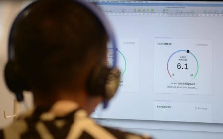
With multiple data sources, it can be hard to know which insights to trust and how to take action on what customers are saying. Connect your research findings with Customer Success Outcomes and act on the insights.

13 minutes
Secondary research, like desk research, is a powerful tool for practitioners to add to their research toolkits. Here’s why you should consider adding it to your next project.
13 minutes
Learn how rage clicks can help you detect user frustration and make data-driven decisions to improve your site.
14 minutes
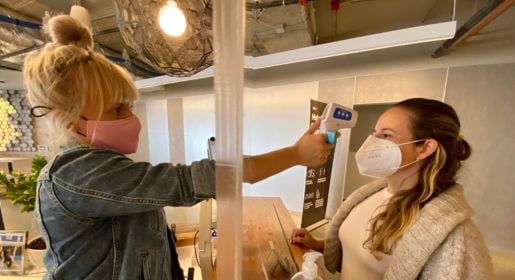
In collaboration with colleagues within and outside of Blink, plus a fair amount of experimenting at home, Chief Innovation Officer Kelly Franznick put together a set of protocols for a safe return to our user research labs.
18 minutes
What do we mean by remote research? When is remote research the right choice? What are some tips for dealing with the challenges that come along with this approach?

12 minutes
Incorporating analytics into UX processes and research methods can add value in many ways. Project teams should use a combination of different data types to consistently measure data (in the wild) about usability and user behavior.
15 minutes
We often perform tests on digital devices such as mobile phones, tablets, and computers. However, there are times when we need to observe user behavior that extends beyond a screen – and this always excites us!
6 min
Your guide to creating a modernized mobile banking or investment app experience — based on our latest banking research.
13 minutes
Want to improve your customers’ experience across all channels? Building a UX framework and cross-branch ambassador program can help. Here’s how to get started.
13 minutes
Understanding your website as a product will set your company apart from competitors.
11 minutes
There's an easy way to test how users will experience your designs on iPhone and iPad with accessibility features enabled.
16 minutes
We set design objectives for creating engaging products that will keep a user’s attention, encourage task completion, and be enjoyable to use. However, of those objectives, we find “enjoyable to use” the hardest to design for and measure. This is in large part because humans perceive experiences differently – what one person thinks is clever and clear, someone else may see as complex and opaque.

13 minutes
In just over two months I’m tying the knot. I’ve always considered myself a perfectionist and highly organized, which is why I opted to do all the planning myself and not hire a coordinator. Food, music, venue, photography, décor, invitations, that’s all me.

19 minutes
A few of us here at Blink are big fans of Car2Go, the point-to-point carsharing service that operates the iconic blue and white SmartCars in several cities worldwide, including here in Seattle (you can typically find three or four outside our office on any given morning).

12 minutes
So how do we get together and collaborate on ideas when a project is top secret? When only one person at Blink knows what the client is working on, and only a handful of employees at the client’s company even know what it is?

12 minutes
A TX business strategy can help companies increase employee experience and customer experience quickly and efficiently.

12 minutes
We answer the question, "What is B2E UX?" and discuss three reasons why adopting easy-to-use technology for your employees will enrich your company.

14 min
Want to design more inclusive products? Learn how, plus, get started with free resources as a guide.
16 minutes
A look at how our DEI efforts came to life in the last year.
17 minutes
Accessible content leads to a more inclusive website, and by following web accessibility best practices, you can also improve search engine optimization (SEO).
15 minutes
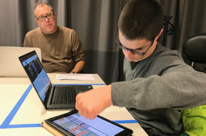
I met with Blake, one of Blink’s assistive device specialists, to discuss the challenges of his mobility impairment and his tips for creating inclusive app and web designs.
15 minutes
These are our first steps toward cultivating a more equitable workplace for our employees, clients, and community.

13 minutes
A positive company culture requires the same careful curation, management, and rigor as any other aspect of a business. At Blink, we consciously design our culture to ensure that employees have the structure and guidance they need to fully develop their skills and abilities for a happy and rewarding career.
12 minutes
As we gear up for our Global Accessibility Awareness Day (GAAD) event on Thursday, May 20, 2021, learn how our UX teams are making accessibility a priority, and how your team can do the same.

10 minutes
Blink is looking forward to integrating version 3 into its existing accessibility practice as soon as it is formalized. All organizations interested in expanding accessibility on the web should welcome this latest addition from the W3C.
14 minutes
Accessibility in the UX industry and at Blink In October studio manager Lynsey Lacher interviewed Joe Welinske, accessibility director and ConveyUX program manager for National Disability Awareness Month.

19 minutes
Banks are bottom-line driven, so if you work in the banking or finance industry, you'll want to be aware of what the top digital banking transformation trends are, how to develop a mobile banking app, and what the future of the banking industry looks like.

4 min
Digital debt impacts innovation, drains employee energy, and challenges organizational productivity. Could AI be the solution?

15 minutes
With the emergence of virtual and augmented reality, we will have many more 3-D digital experiences available to us. Many of these upcoming 3-D experiences will be interactive, requiring the user to navigate a 3-D space. While it may take some time for these experiences to catch on and become pervasive, They will.

13 minutes
“How can we design systems to use the sophistication of human thinking and decision making, AND the complex computation power of machines to strike a healthy balance of automation?”
1 min
Our process for creating products and experiences people love.
2:21
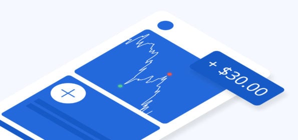
From automatic power reroutes during outages to personalized banking experiences, and real-time education support, AI is revolutionizing industries. See how AI is making waves in utilities, finance, education and healthcare with Blink's VP of Design, Scott Lambridis.
3 min
Developing a strategy for online grocery shopping.
1 min
Blink researchers and designers share what we do best.
2 min
Creating a new online destination for car shopping.
3 min
Developing a smart baby warmer for the U.S. market.
Aug 20, 2023
38 Episodes
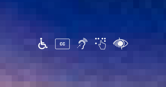
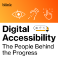
Conversations with the people who are making digital products and services more accessible.
May 30, 2023
34 min
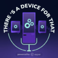
Blink's Head of Design, Byron Baker, joins "There's A Device For That" to share his experience leading a team of design experts as they create user experiences that truly enhance the value and impact of devices.

Apr 11, 2023
21 min
Blink’s Chief Design Office and Avangrid’s Head of CX and Digital Transformation join The CX Cast to share their experience building a CX function at Avangrid.
Apr 18, 2023
22 min
Blink and Avangrid continue their conversation about the role of design in creating quality experiences at Avangrid.
Upcoming

May 9, 2024
Join us in-person on Thursday, May 9, for our first New York City UX Leadership Exchange.
Past

Apr 18, 2024
We're hosting a virtual UX Leadership Exchange on Thursday, April 18. Register today!

Feb 27, 2024
12th annual event in Seattle by Blink UX
Jan 25, 2024

Sep 22, 2022
Blink hosted a DEI in Design Virtual Roundtable on September 22, 2022, as part of San Diego Design Week (SDDW) presented by Mingei International Museum.

1 min
NASA released its updated website last month after two years of rigorous user experience research, strategy, and design in collaboration with Blink UX.

6 min
Blink ranked by Puget Sound Business Journal on its annual list of best midsize workplaces.
14 minutes
Blink was recognized for its work with Applied Training Solutions and HERO Index.
11 minutes
Mphasis, (BSE: 526299; NSE: MPHASIS), an Information Technology (IT) solutions provider specializing in cloud and cognitive services, announced today, its acquisition of Blink UX, a User Experience research, strategy, and design firm that works with the world’s leading companies to create transformative digital products, brands, and experiences.

9 minutes
Blink's title was awarded based on results from the 2021 statewide employee survey conducted by the Puget Sound Business Journal.
10 minutes
For the fifth time, Blink appears on the Inc. 5000, ranking No. 2283 with three-year revenue growth of 45% percent.
13 minutes
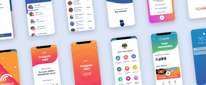
Blink was recognized for our design work with the Special Olympics.
9 minutes
The 2020 report cites Blink’s work with NASA.
12 minutes
SBA Administrator Jovita Carranza has appointed three small-business leaders from Washington state, including Blink’s Karen Clark Cole, to the U.S. Small Business Administration Federal Regulatory Fairness Board, representing Region 10.

10 minutes
Blink ranks #1 of over 200 companies to win Top-Ranked Overall Culture at annual Tech Culture Awards.

10 minutes
UX research and design firm Blink UX is pleased to announce that Accessibility Director Joe Welinske has been appointed to King County Metro’s Access Paratransit Advisory Committee (APAC).

11 minutes
Blink was recognized among the vendors in the 2020 report

Newsletter sign-up
Join our list for event updates, UX insights, tips for great customer experiences, and more.